Apothic Wines

Falstaff Winery - Listed
Apothic Wines belongs to the modern California red-blend movement rather than the estate-tasting-room tradition. Built in Modesto under the E. & J. Gallo orbit, the label favors dark visual branding, smooth fruit-forward blends, and at-home formats over vineyard ceremony, making it a useful lens on how mass-market wine learned to speak with mood, consistency, and immediate flavor cues.

Pearl is the En Primeur Club membership app — saves, bookings, and concierge access live there. Same editors, same standards.
- Address
- Modesto, California, Vereinigte Staaten
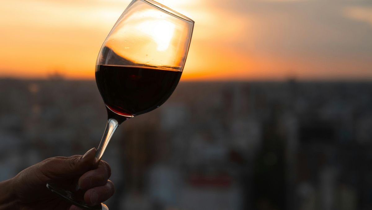
The clearest signal for Apothic Wines in Modesto is its visual identity: bold, smooth, fruit-forward branding with a deliberately dark, gothic-inspired look. The positioning is modern and iconic rather than pastoral, framing the brand as playful and date-night-friendly instead of as a traditional tasting-room visit. In other words, the useful starting point is not a detailed estate narrative or a confirmed hospitality program, but the way the brand presents itself: visually direct, mood-led, and easy to recognize.
That limit is important because it keeps the description focused on what can be said with confidence. The confirmed picture is a wine identity, not a full catalog of on-site features, and that distinction should guide expectations.
Wine branding with a dark, modern mood
Apothic Wines is best described through its confirmed brand language. The style leans into a gothic-inspired identity, with a smooth, fruit-forward feel and a visual tone designed to be memorable. Rather than presenting itself as a formal estate experience, it is framed as approachable, playful, and suitable for a casual date-night context. The mood is the message: dark without being forbidding, polished without sounding ceremonial, and contemporary enough to feel immediately legible to people who want wine to come with a strong point of view.
That distinction matters for people deciding what kind of wine experience they are looking for. What is grounded is the brand’s emphasis on atmosphere, accessibility, and a modern visual identity. It suggests a wine choice that is less about ceremony, technical detail, or a slow educational format, and more about a clear sensory promise: boldness, smoothness, and a fruit-forward profile wrapped in an unmistakable visual style.
Within Modesto, Apothic Wines can be approached as a wine-brand reference point rather than as a source of confirmed estate-style details. Other dining and drinking options in Modesto may offer a different kind of local outing, but Apothic Wines’ confirmed appeal rests on its dark, iconic presentation and approachable price point. For someone scanning the area for wine-related options, that means Apothic Wines belongs in the conversation as a recognizable identity, especially for guests who are drawn to a modern label style and an easygoing, date-night-friendly feel.
A wine identity built around mood, not ceremony
The facts point to a brand experience shaped more by mood than by ceremony. Apothic Wines is framed as bold, smooth, and fruit-forward, with branding that feels intentionally dark and contemporary. That makes it a fit for drinkers who respond to a clear aesthetic and a low-pressure wine identity. The appeal does not depend, in the confirmed information here, on a named host, a structured service format, or detailed production language; it depends on a strong, repeatable impression.
The grounded description is simpler: Apothic Wines in Modesto presents a modern, dark, date-night-friendly wine identity at a listed $10 per person price point. That sentence captures the usable core without stretching beyond what is verified. It gives visitors a practical frame: expect approachability and recognizable style, not a confirmed list of extras or a formal tasting-room script.
Visual language does important work. Instead of relying on confirmed claims about a traditional tasting-room structure, the brand’s profile emphasizes atmosphere: gothic-inspired, iconic, smooth, and fruit-forward. The result is a wine identity meant to be understood quickly and casually. It is the kind of positioning that makes sense for someone who wants a bottle or wine reference with a mood already attached to it, rather than a blank or purely technical presentation.
That mood-led identity is also what makes the brand feel distinct in a general wine context. The dark look gives it contrast; the smooth, fruit-forward description keeps it approachable; and the date-night framing gives it an informal social use. None of that requires adding unconfirmed details. It simply draws out the meaning of the language already attached to Apothic Wines.
How to place it in a Modesto wine itinerary
For a Modesto itinerary, Apothic Wines is best placed as a brand-led wine reference point rather than as a confirmed vineyard-tour destination. The available facts do not verify a detailed hospitality format, so expectations should stay general: a modern, dark, fruit-forward identity and an accessible $10 per person listing. That makes it most useful as a simple, style-driven anchor within a broader plan, especially for visitors who prefer a wine option that feels casual and visually distinctive.
Visitors can pair that understanding with other unnamed dining, bar, hotel, and experience options in Modesto depending on the rest of the trip. Instead, use the confirmed information to decide whether the mood fits the occasion.
The critical read is direct: Apothic Wines’ confirmed appeal sits in its branding and positioning. In Modesto, it represents a bold, smooth, gothic-inspired wine identity designed to feel approachable, modern, and date-night-friendly. Read on those terms, it is not defined by ceremony or extensive confirmed hospitality details, but by a clear visual and emotional promise: darkly styled, easy to grasp, and built around a fruit-forward sense of accessibility.
Recognition history
Dated appearances from independent guides and award organizations, with the underlying list record or original source where available.
Falstaff Winery - Listed
Falstaff
Continue exploring
More in Modesto
Wineries in Modesto
Browse all →

Bars in Modesto
Browse all →
Restaurants in Modesto
Browse all →
Details
- Modern
- Well Known
- Date Night
- Group Outing
- Special Occasion
- Red Blend
- Merlot
- Cabernet Sauvignon
- Syrah
- Zinfandel
- Pinot Noir
- Pinot Grigio
- Still Red
- Still White
- Still Rosé
- Virtual Tasting
Bold, smooth, fruit-forward branding with a deliberately dark, gothic-inspired identity; the site frames the experience as a playful, date-night-friendly wine brand rather than a traditional tasting-room visit.